Web Design
1 August 2026
7 min read
How to Improve Your Website in 3 Simple Steps
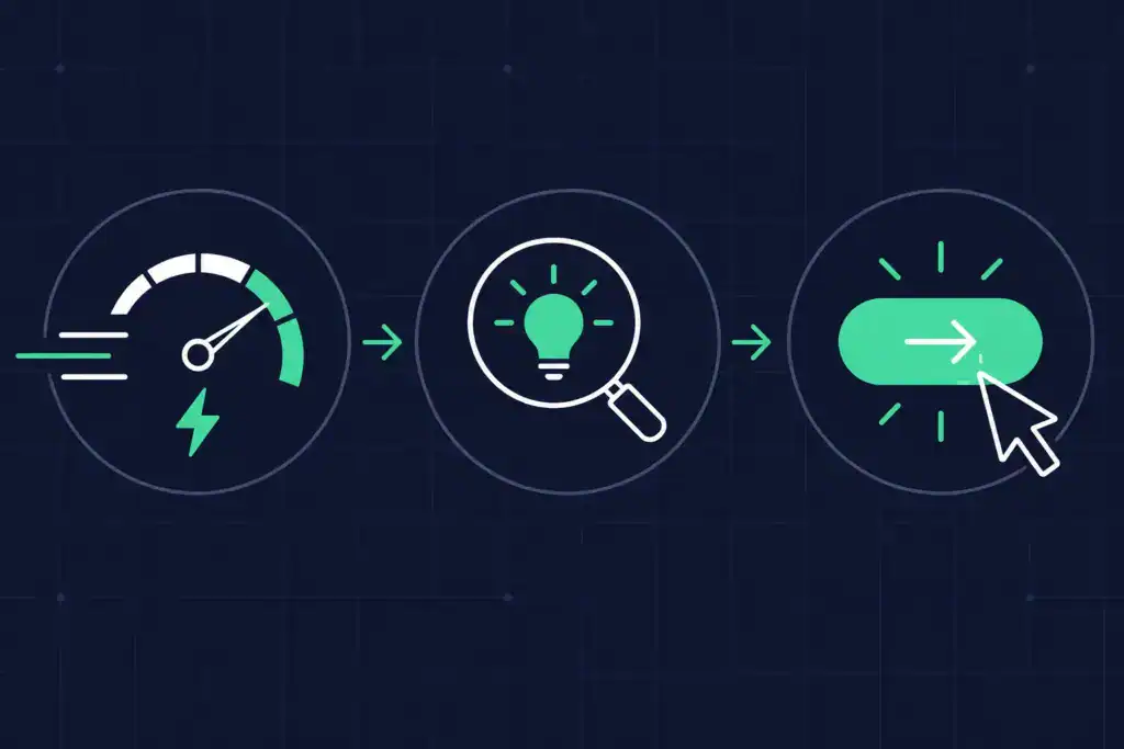
Want a better-performing website? Start with these 3 things: make it faster, easier to find and understand, and easier for customers to take action.
In this article
Quick answer
Want to improve your website?
Start with three things:
Make it faster.
Make it easier to find and understand.
Make it easier for people to take the next step.
That’s it.
Not another animation.
Not seven new plugins.
Not a homepage redesign because someone in the office has suddenly decided they don’t like the blue.
And definitely not adding more stuff simply because the website feels like it needs “something”.
Most underperforming websites don’t need more.
They need less friction.
Let’s show you where to start.
Before you redesign your website, ask what's actually wrong with it
When a website isn’t generating enough enquiries, the immediate reaction is often:
“We need a new website.”
Maybe.
But not always.
Sometimes the bones of the website are perfectly good.
The real problem might be that it takes forever to load.
Or nobody can find it.
Or people can find it, but can’t work out what you actually do.
Or they understand what you do, but have absolutely no idea what they’re supposed to do next.
A complete redesign isn’t automatically the answer.
First, identify the friction.
At Launch Digital, we tend to look at website performance through three simple questions:
1. Can people access it easily?
2. Can people find and understand it?
3. Can people work out what to do next?
If the answer to any of those is no, you’ve found somewhere to start.
Step 1: Make your website faster
Nobody visits your website because they’ve always dreamed of watching a loading icon.
They came for something.
An answer. A service. A price. A product. A phone number. Some proof that you’re the right business for the job.
Every unnecessary second between clicking and getting that information creates friction.
Website performance also forms part of Google’s page experience considerations through metrics such as Core Web Vitals.
But forget Google for a moment.
A slow website is annoying.
That’s reason enough to care.
Start with the obvious problems
Run some of your important pages through Google PageSpeed Insights.
Don’t just test the homepage.
Test:
• your main service pages
• high-traffic landing pages
• contact page
• important blog content
• key conversion pages
Then look for the things slowing them down.
Your images are enormous
This is a common one.
You don’t need to upload the enormous original photograph straight from a professional camera just because WordPress lets you.
Resize and compress images appropriately before or during upload, and use modern image formats where suitable.
The aim is to maintain the visual quality you need without making visitors download unnecessarily large files.
Your website is carrying years of baggage
Plugins. Scripts. Tracking tools. Widgets. Old functionality. That pop-up someone installed in 2021 and forgot existed.
Every addition doesn’t automatically make your website slow, but unnecessary code and third-party resources can contribute to performance problems.
If you’re not using something, ask whether it still needs to be there.
Your hosting isn't helping
Your website’s hosting environment matters too.
A beautifully optimised website sitting on inadequate hosting can still struggle.
Look at the entire performance picture rather than assuming another optimisation plugin will magically fix everything.
Don't become obsessed with the score
This is important.
You are not building a website for PageSpeed Insights.
You’re building it for people.
Use performance tools to diagnose problems, not as a game where the objective is to reach 100 at all costs.
The better question is:
Does this website feel fast and stable for the people actually using it?
Especially on mobile.
The Launch Digital principle
Remove the wait.
If something is making your customer wait unnecessarily before they can get what they came for, investigate it.
That’s friction you don’t need.
Step 2: Make your website easier to find AND understand
This is where website improvement gets more interesting.
Because being found and being understood are increasingly connected.
You need Google to understand your website.
You want AI systems to understand your website.
And most importantly, you need your potential customers to understand your website.
Fortunately, a lot of the fundamentals overlap.
Start with what your customer actually wants to know
One of the easiest ways to make website content unnecessarily complicated is to start with what you want to say rather than what your customer needs to know.
There’s a difference.
Your customer is probably asking questions like:
Do you do the thing I need?
Do you work with businesses like mine?
Can you solve my problem?
How does it work?
How much does it cost?
Why should I trust you?
What happens next?
Your website should make those answers easy to find.
That sounds obvious.
You’d be surprised.
Give each important page a clear purpose
A page trying to rank for twelve unrelated services, target six audiences and answer every question anyone has ever asked your company is going to struggle.
So is the person reading it.
Decide what the page is about.
Then make that obvious through:
• a clear page title
• one descriptive H1
• useful H2 and H3 headings
• focused copy
• relevant internal links
• descriptive URLs
• appropriate image alternative text
• structured data where relevant
This is good for SEO.
It’s also good for humans.
And increasingly, it’s useful when machines are trying to understand and retrieve specific information from your website.
Answer the question before writing the essay
This is something we’re building into more of our content at Launch Digital.
If somebody lands on a page with a specific question, don’t make them read 900 words before you answer it.
Give them the answer.
Then give them the depth.
That’s why you’ll notice the Quick answer near the beginning of this article.
Someone who wants the short version gets it.
Someone who wants to understand how to actually improve their website can keep reading.
That’s ADHD-friendly content design in action.
It reduces the amount of effort required to find the important information without removing the detail for people who want it.
And frankly, you don’t need ADHD to appreciate that.
Think beyond traditional Google rankings
SEO still matters enormously.
But search behaviour is changing.
People are increasingly discovering information through AI-powered search experiences and tools as well as traditional search results.
That means we need to think about whether your website clearly communicates:
• who you are
• what you do
• who you help
• where you operate
• what you know
• why you’re credible
• how your services or products relate to the questions people are asking
This is where traditional SEO starts overlapping with AEO and GEO.
We don’t see these as completely separate worlds.
Good digital visibility starts with making your business easy to discover and easy to understand.
For people and machines.
The Launch Digital principle
Remove the confusion.
If someone has to work hard to understand what you do, who it’s for or where to find the information they need, your website is creating friction.
Step 3: Make the next step ridiculously obvious
You’ve done it.
Your website loads quickly.
Someone found you.
They understand what you do.
They’re interested.
And then…
Nothing.
No obvious next step.
No clear call to action.
A contact button hidden in a dropdown menu.
A form requiring fourteen fields, their first pet’s name and possibly a statutory declaration.
This is where websites lose perfectly good opportunities.
Every important page needs a job
Ask yourself:
What do we want someone to do after reading this page?
Get a quote? Book a call? Buy a product? Call you? Make an appointment? Download something? Visit another page?
There may be secondary actions available, but the primary next step should be obvious.
Your customer shouldn’t need to solve a puzzle.
Stop giving people seventeen choices
More choice doesn’t automatically create a better experience.
Sometimes it creates paralysis.
This is especially relevant to ADHD-friendly design.
If every section screams BOOK NOW! DOWNLOAD THIS! JOIN OUR NEWSLETTER! WATCH OUR VIDEO! GET A QUOTE! CHAT WITH US! the visitor has to decide which of those six things matters.
You’re making their brain do unnecessary work.
Instead, create a clear hierarchy.
What is the most logical next step?
Make that prominent.
Make contacting you easy
If the goal is an enquiry, don’t hide the contact information like it’s an Easter egg.
Your phone number, contact page or enquiry pathway should be easy to find.
And look carefully at your forms.
Do you genuinely need every field you’re asking someone to complete?
Every additional question is another opportunity for someone to think:
“I’ll do this later.”
And we all know how that can end.
Give people a reason to trust you before asking them to act
A call to action isn’t magic.
Putting GET A QUOTE on a button doesn’t automatically make someone ready to click it.
They may need evidence first.
That could include:
• testimonials
• reviews
• case studies
• client logos
• project examples
• qualifications
• accreditations
• awards
• useful guarantees
• relevant results
• clear explanations of your process
Don’t just tell people you’re brilliant.
Show them why they should believe you.
That’s why our work and case studies are such an important part of the Launch Digital website.
They let potential clients see what we’ve actually done.
The Launch Digital principle
Remove the decision friction.
Once someone is ready to move forward, make moving forward feel like the easiest part of the experience.
Notice what we didn't tell you to do
We didn’t tell you to redesign your logo.
We didn’t tell you to change all your fonts.
We didn’t tell you to install an AI chatbot.
We didn’t tell you your homepage needs a video background.
We didn’t tell you to publish four blog posts a week.
We didn’t tell you to rebuild the entire website.
Because before adding anything new, we’d rather ask:
What’s currently getting in the way?
That question leads to better decisions.
Sometimes the answer genuinely will be:
“This website has had a good innings. It’s time.”
In that case, a strategic website redesign makes sense.
But sometimes fixing a handful of high-impact problems can substantially improve the website you already have.
The three things we'd fix first
If you only remember three things from this article, make them these:
1. Remove the wait
Make your website faster and easier to access.
2. Remove the confusion
Make your business, content and expertise easier to find and understand.
3. Remove the decision friction
Make the next step obvious and easy to take.
Speed. Clarity. Action.
That’s a much more useful website improvement strategy than adding more stuff and hoping something works.
And it sums up a lot of how we think about digital at Launch Digital.
Because the best websites don’t make people work harder.
They make it easier for the right people to find you, understand you, trust you and take the next step.
Frequently Asked Questions
Do I need to redesign my whole website to improve it?
Not necessarily. If the website’s underlying structure and technology are still suitable, improving performance, content, SEO, UX and conversion pathways may be enough. A full redesign makes more sense when the website no longer reflects the business, has significant technical or usability problems, can’t support your current strategy or would require so many individual fixes that rebuilding becomes the better option.
How do I know what's wrong with my website?
Start with data rather than opinions. Look at website analytics, Google Search Console, PageSpeed Insights, enquiry and conversion data, search visibility and feedback from actual customers. Then assess the website yourself on both desktop and mobile. Can you quickly understand what the business does? Can you find important information? Is the next step obvious? Those questions often reveal problems surprisingly quickly.
What's the first thing I should improve on my website?
Start with the issue creating the biggest barrier for your customers. If the site barely loads, fix performance. If nobody can find you, investigate search visibility. If you’re getting traffic but no enquiries, look at messaging, UX, trust and conversion pathways. There isn’t one universal first fix because the problem isn’t the same on every website.
Does website speed affect SEO?
Website performance forms part of the overall page experience, and Google’s Core Web Vitals measure aspects of loading performance, responsiveness and visual stability. But speed isn’t SEO by itself. A fast page still needs to be relevant, useful and understandable.
How can I make my website more ADHD-friendly?
Start by reducing unnecessary cognitive load. Use clear headings, shorter sections, descriptive navigation, strong visual hierarchy, obvious calls to action and fewer competing messages. Make important information easy to scan and don’t force visitors to remember information from one part of the page to understand another. The aim isn’t to remove detail. It’s to make detail easier to process.
What's the difference between SEO and AI search optimisation?
SEO focuses broadly on improving visibility through search engines such as Google. AEO and GEO consider how content and brands can also be understood, retrieved and potentially referenced by answer engines and generative AI experiences. There is significant overlap. Clear structure, useful content, technical accessibility, authority and genuine expertise can support visibility across both traditional and AI-driven search environments.
Will adding FAQs help my website appear in AI search?
FAQs can be useful because they provide clear answers to genuine customer questions in an easy-to-understand structure. But simply adding an FAQ section doesn’t guarantee that an AI system will cite or recommend your website. The quality of the information, relevance, authority, clarity and broader signals around your business and content also matter.
Ready to improve your website?
You don’t necessarily need more website.
You need the website you already have to work harder.
Faster. Clearer. Easier to find. Easier to understand. Easier to use. Easier to act on.
That’s what we mean when we talk about ADHD-friendly, conversion-focused web design.
We’re not designing websites exclusively for people with ADHD.
We’re applying principles that reduce cognitive load and unnecessary friction because they create a better experience for everyone.
If your website is making your customers work too hard, explore our Web Design services, learn about our SEO and AEO/GEO services, take a look at our work, or talk to Launch Digital.
Less friction. More clarity. Better outcomes.
Ready to make your website work harder?
Less friction. More clarity. Better outcomes.
Related Articles

LOCAL SEO
12 September 2026
If your business serves customers in a specific area, local SEO is the highest-ROI investment you can make.
WEB DESIGN
15 August 2026
You probably need a website redesign if your site no longer reflects your business, is difficult to find, slow to load, frustrating on mobile, hard to navigate, outdated or simply isn’t generating enough enquiries.
WEB DESIGN
22 August 2026
The best websites in 2026 aren’t the cleverest or trendiest. They’re the easiest to use, and the easiest for Google and AI platforms to understand.